DEGXNERATE YOUTH
DEGXNERATE YOUTH / web design + social media + print design
04 .
01. MENU tab
Section where clients can request to rent clothing. CSS coded to allow fading between images with hover gesture. There is also a “RENT GARMENT” button that takes user straight to an empty email where they can send inquiries directly to the brand.
1. Challenge
Degxnerate Youth needed a cohesive digital presence that could translate its dark, inclusive-driven identity into an immersive online experience. The challenge was to create a website and supporting visual content that felt bold and intentional while remaining clean, functional, and easy to navigate. The brand required consistent visuals across social media, photography, and live fashion events all while operating with limited resources and a small team.
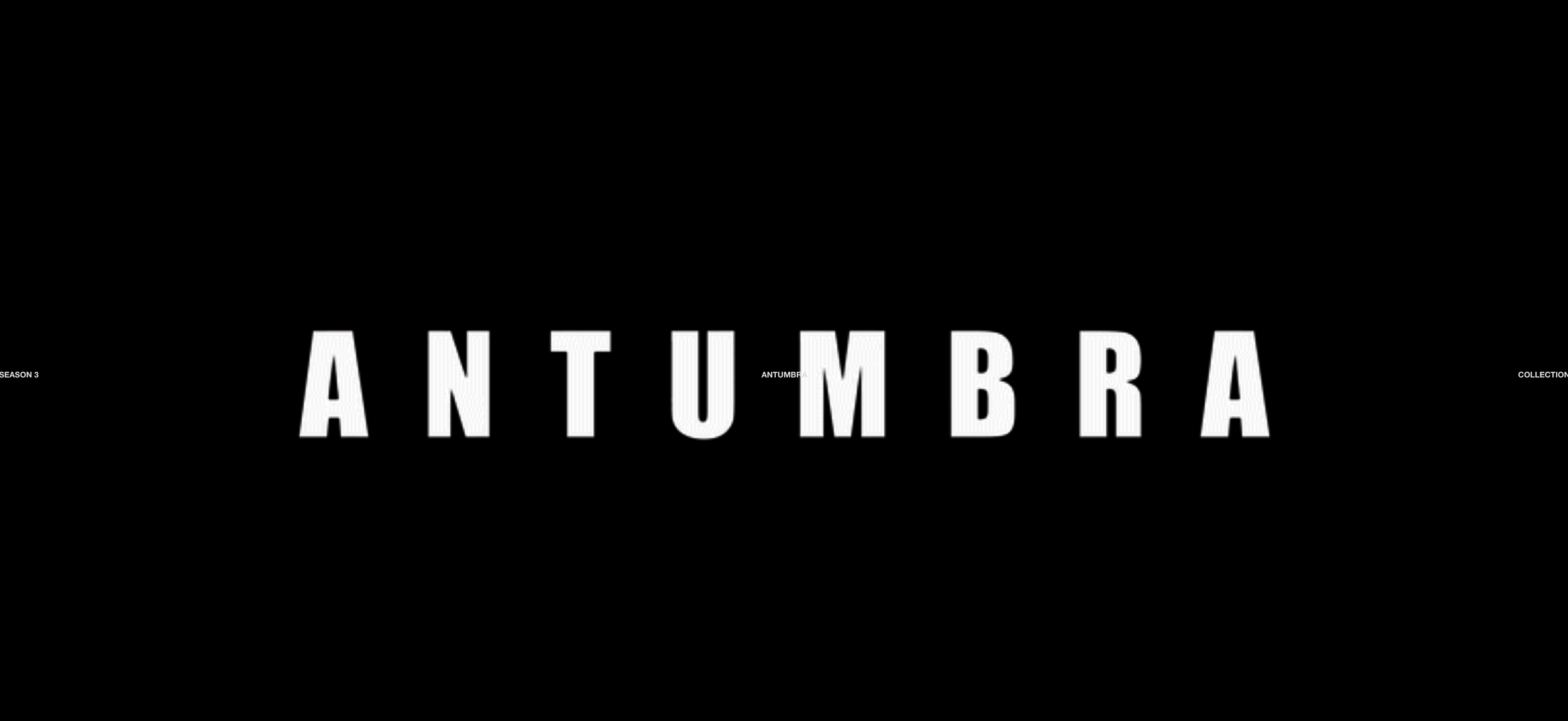
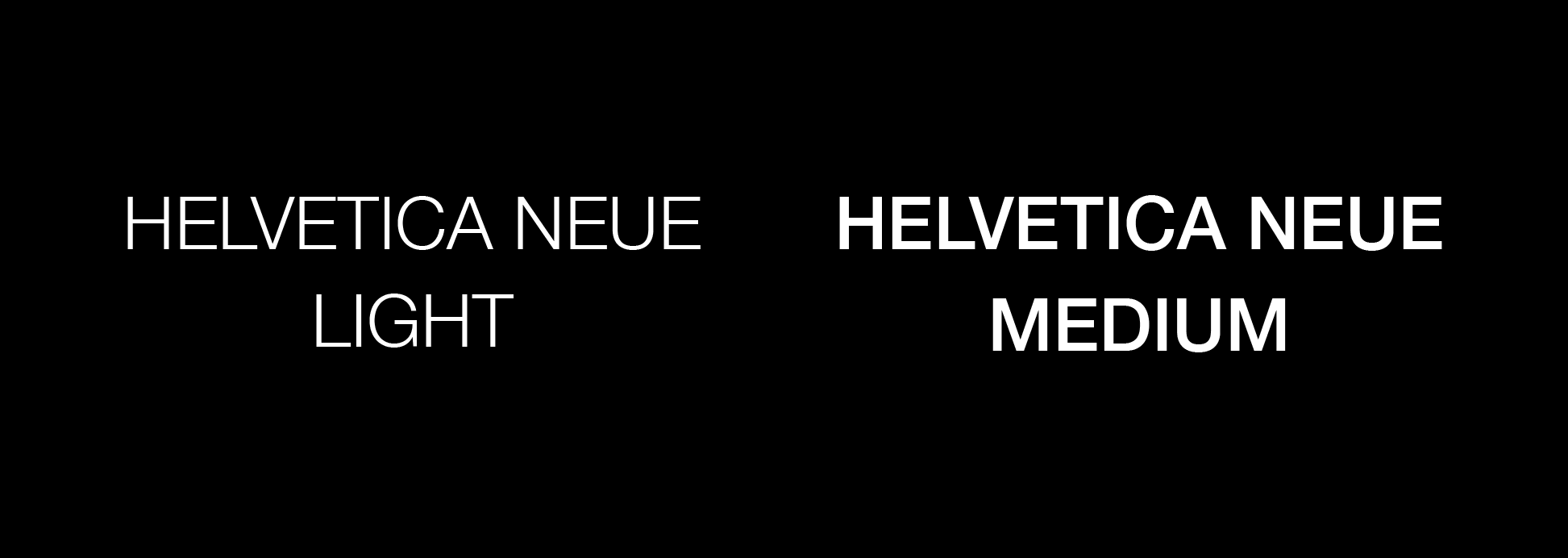
TYPOGRAPHY
As Co-Creative Director of Degxnerate Youth, I lead and execute the brand’s full visual content. I designed and implemented the website to embody its dark, minimal identity, while also producing and editing all photography and video content for social media. In addition, I design graphic posters and visual backdrops for live fashion events, ensuring the brand remains cohesive across digital and physical experiences.
PROJECT: WEB DESIGN, POSTER DESIGN, GRAPHIC DESIGN, SOCIAL MEDIA, VIDEO EDITING, PHOTOGRAPHY, IMAGE EDITING
PROGRAM/SKILLS: Adobe After Effects, CSS, Adobe Illustrator, Photography
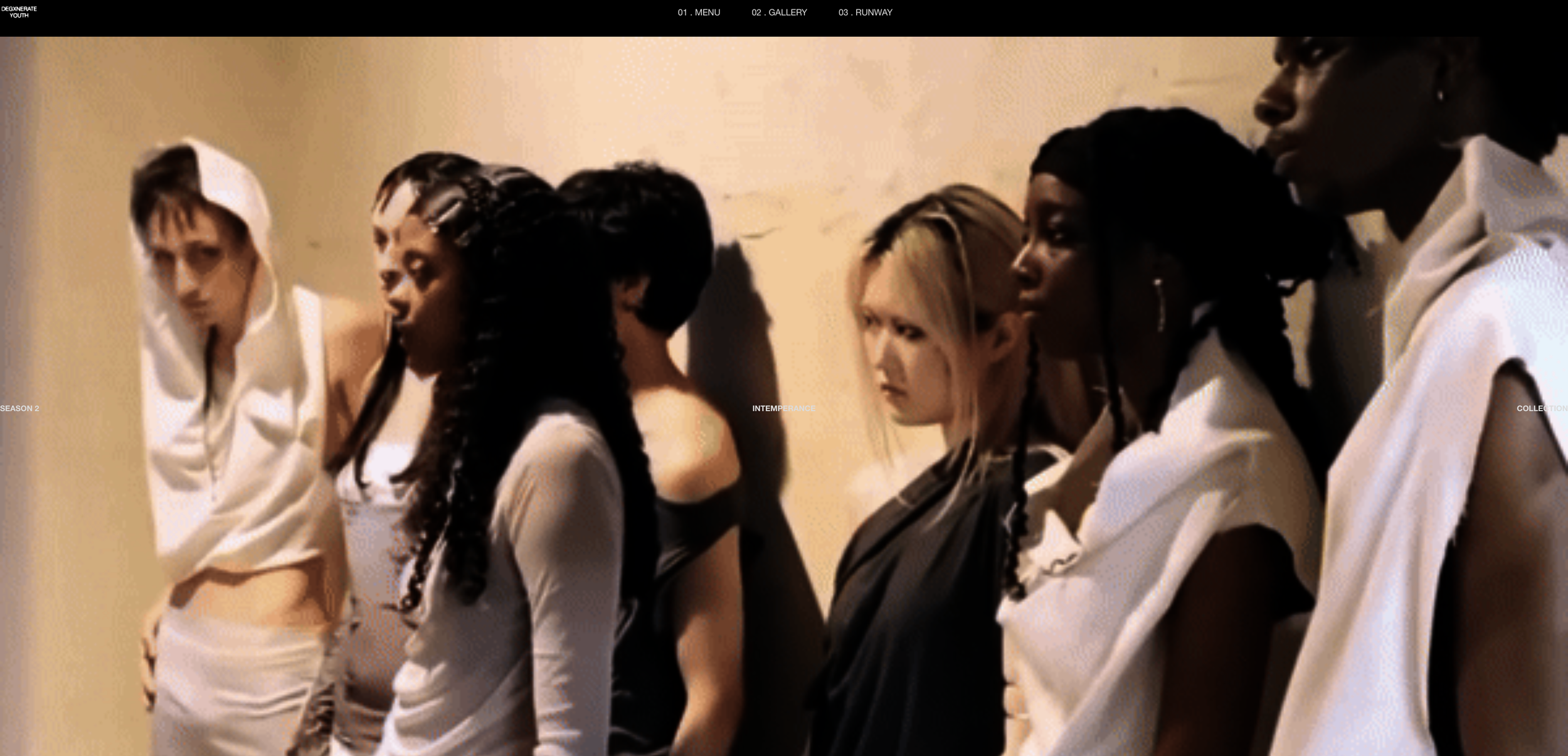
03. RUNWAY tab
Sections each contain runways pictures straight from the runway of each garment from the collection along with a short descriptions.
When scrolling down in the homepage, you can see sections for each collection with an eye-catching visuals representing each one. Clicking on these will lead you directly to its section in the runway tab.
02. GALLERY tab
This is where you can learn more about the brand and different concepts within the brand.
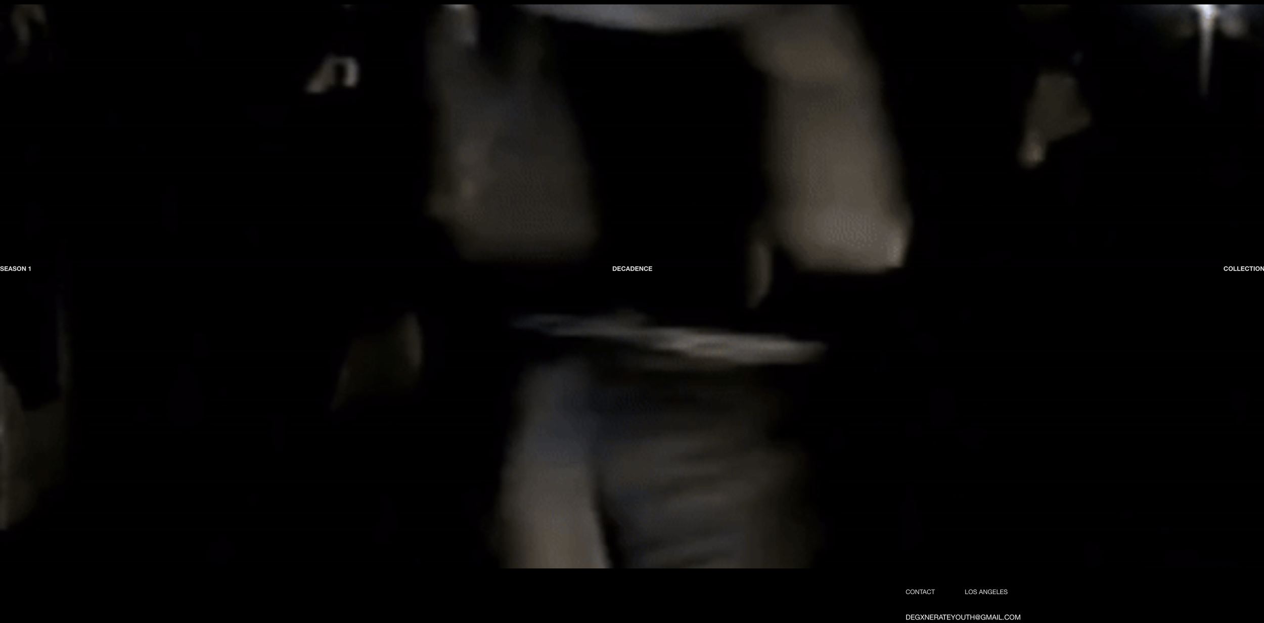
The site opens up to a section where videos from the Intemperance campaign are stacked next to each other with the Degxxnerate Youth layered logo on top to grab attention.
2. Approach
I approached the project by first defining a clear visual system rooted in minimal typography, bold contrast, and intentional use of negative space to maintain the brand’s edge without overwhelming viewers. I designed the full website experience, incorporating custom code adjustments to refine layout and interaction details.
I developed a cohesive content approach by directing and editing all photography, retouching images, producing and editing video content for social media, and designing graphic posters and visual backdrops for live events.
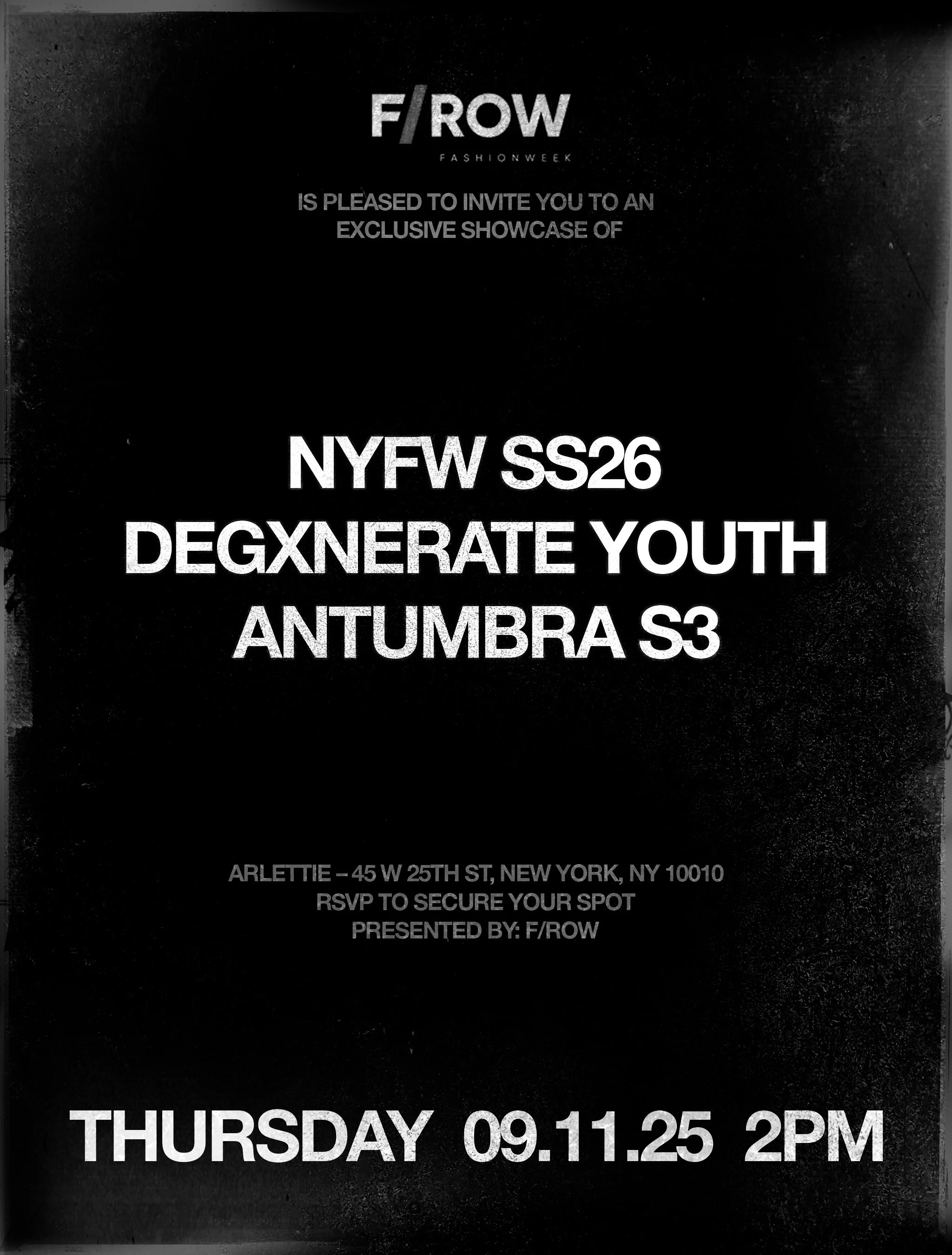
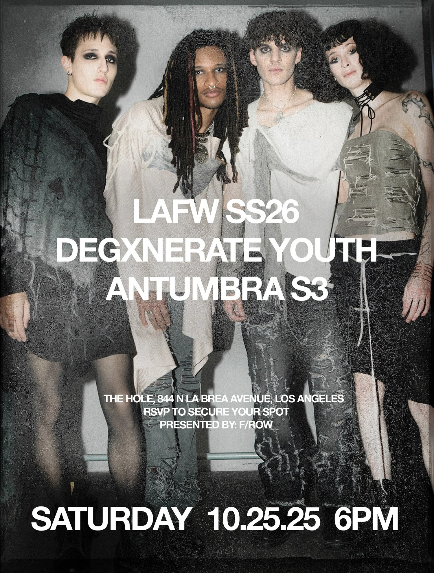
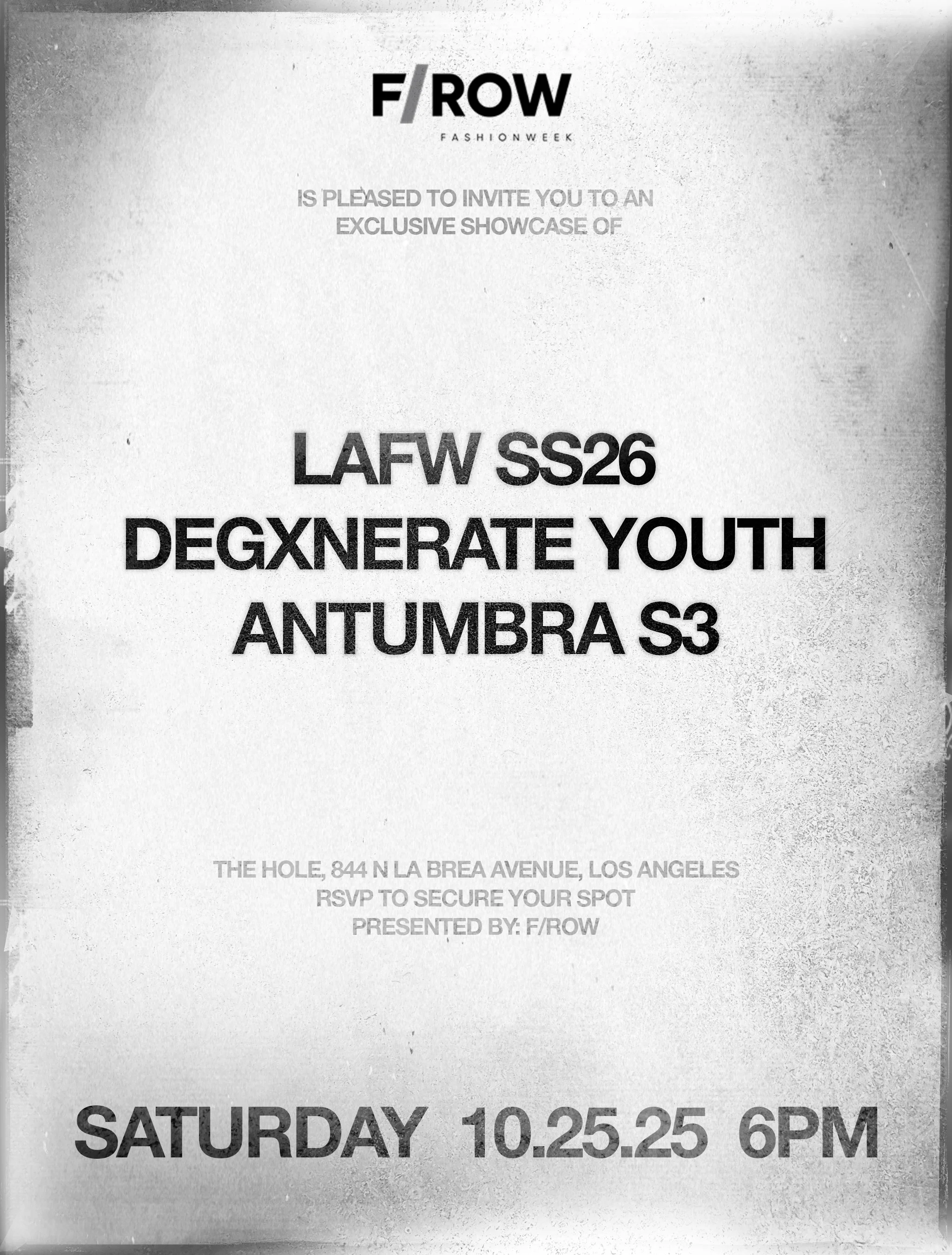
EVENT Print Posters
Helvetica reinforces Degxnerate Youth’s identity by creating a sharp contrast between minimal structure and rebellious content which aligns with the brand’s ethos of often finding the balance between two contrasting concept like avant garde and anti-fashion. Its clean letters feel neutral and allows the edgy visuals to hit harder., while the slight bold medium weight adds confidence.